Above is the first layout that I created using this line.
I added a couple journal sprouts from Jillibean and used a couple of my little alpha sticker to do my journaling.
I used American Crafts brads that went really well with the line and created some banner pennants to put on the side of my layout.
Like always I added some stitching to give my page more texture as well as dimension. I used my Silhouette Cameo to cut out my title for this layout as well as the large heart for my background.
Below is the second layout that I created:
The colours of this line worked awesome with my cousins bathing suit and made the picture stand out alot!
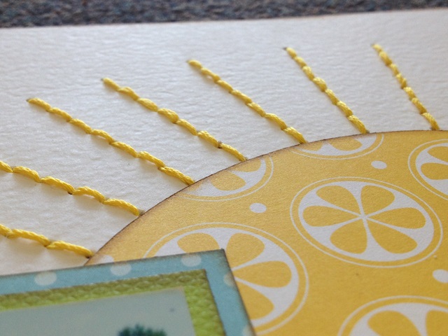
I cut a circle out on my Cameo and then stitched the rays of the sun around it. I love how my sun turned out!
I added some stitching to the wave paper I incorporated to add some texture and dimension. I also used my Cameo to cut out my title for this layout.
To finish off the layout I added a couple of the diecuts that came with the line and then added a few I had hanging around in my stash!
Thanks for stopping by!
Amandaaa.xo


5 comments:
OMG!!! I love these layouts Amanda!!
I love the colors and love love love the fonts!!
I am a 2 page girl at heart, but your layouts are making me change my mind. Thank you.
Thanks ladies!
Fabulous pages! Great stitching and title fonts!
Post a Comment